Redesign

Be real
in your
circle.

A redesign of BeReal's posting flow, feed, and audience model. Built around intimate circles instead of open friend lists.

01

Context

While BeReal experienced rapid initial growth, peaking at approximately 73.5M MAU in 2022, the platform has since stabilized at 40M MAU (2025, per BeReal). Based on user observations and market analysis, this drop is largely driven by two core UX friction points.
01

Context Collapse and Performative Pressure

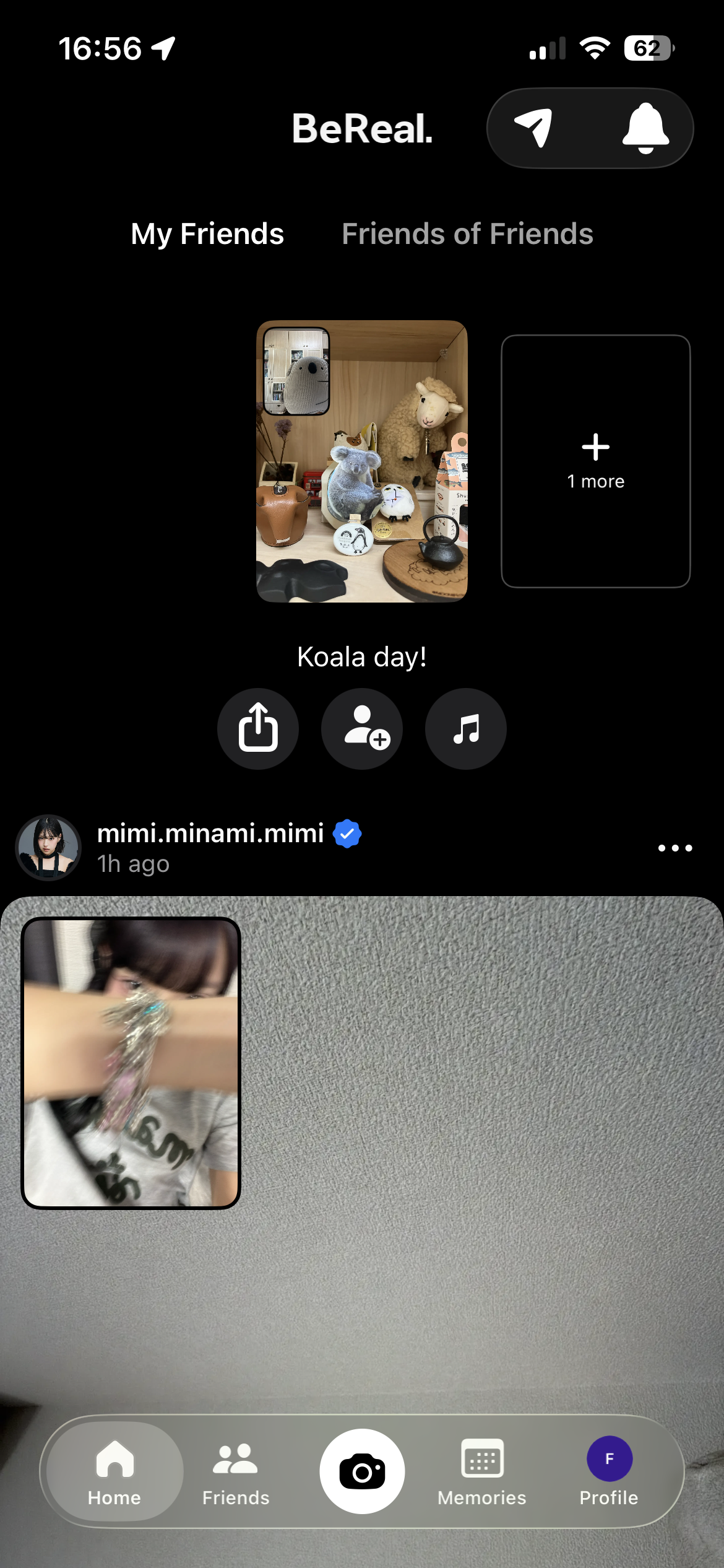
BeReal's current audience model defaults to broadcasting to a user's entire friend list. As social graphs expand, users experience heightened pressure to curate their lives. This leads to a behavioral shift where users intentionally delay their posts until they are doing something photogenic, fundamentally undermining the app's core value proposition of spontaneous sharing.

"Is it me or does BeReal feel like a stalker's paradise for everyone?"

— social media user, 2022

"There was a lot of social pressure to be posting things that were not real. It has become status and image based."

— BeReal user
Addressed by: New Circle BeReal
02

Format Monotony and Content Fatigue

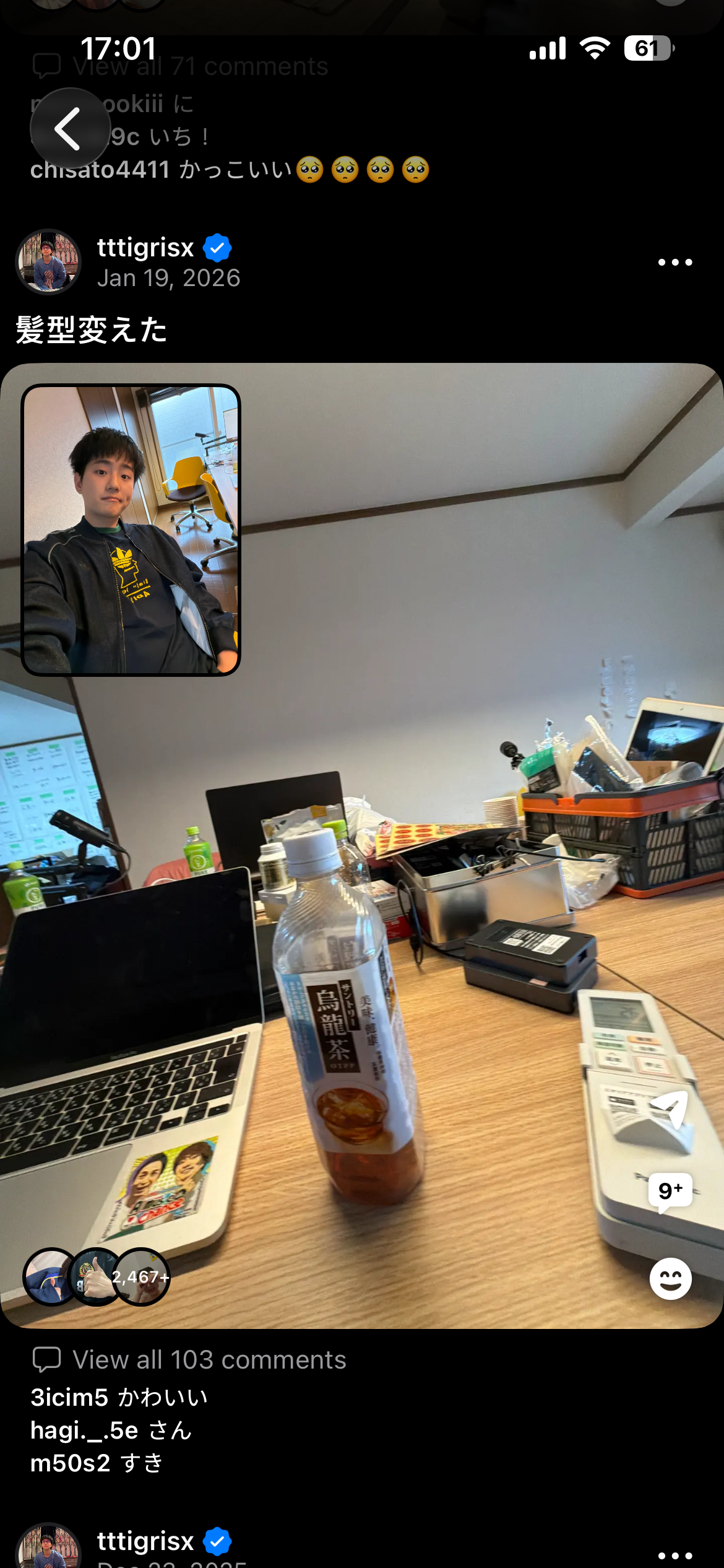
BeReal's dual-camera format was built on a genuine insight: capturing both what you see and how you look reacting to it creates a "360-degree angle" that builds trust and intimacy you can't find anywhere else. However, a feed consisting entirely of repetitive daily environments — desks, laptop screens, ceilings — diminishes the incentive to keep opening the app. Users also report not always feeling prepared to be captured on their own face, especially within the countdown timer.

"How many times can I take a photo of me at my desk doing boring work?"

— BeReal user

"It stops feeling spontaneous. It starts feeling like a chore."

— BeReal user
Addressed by: Shape Dual Camera
02

Design Goal

Transition the interaction from broad broadcasting to intimate, circle-based sharing, fostering a low-pressure ambient co-presence for close-knit groups.

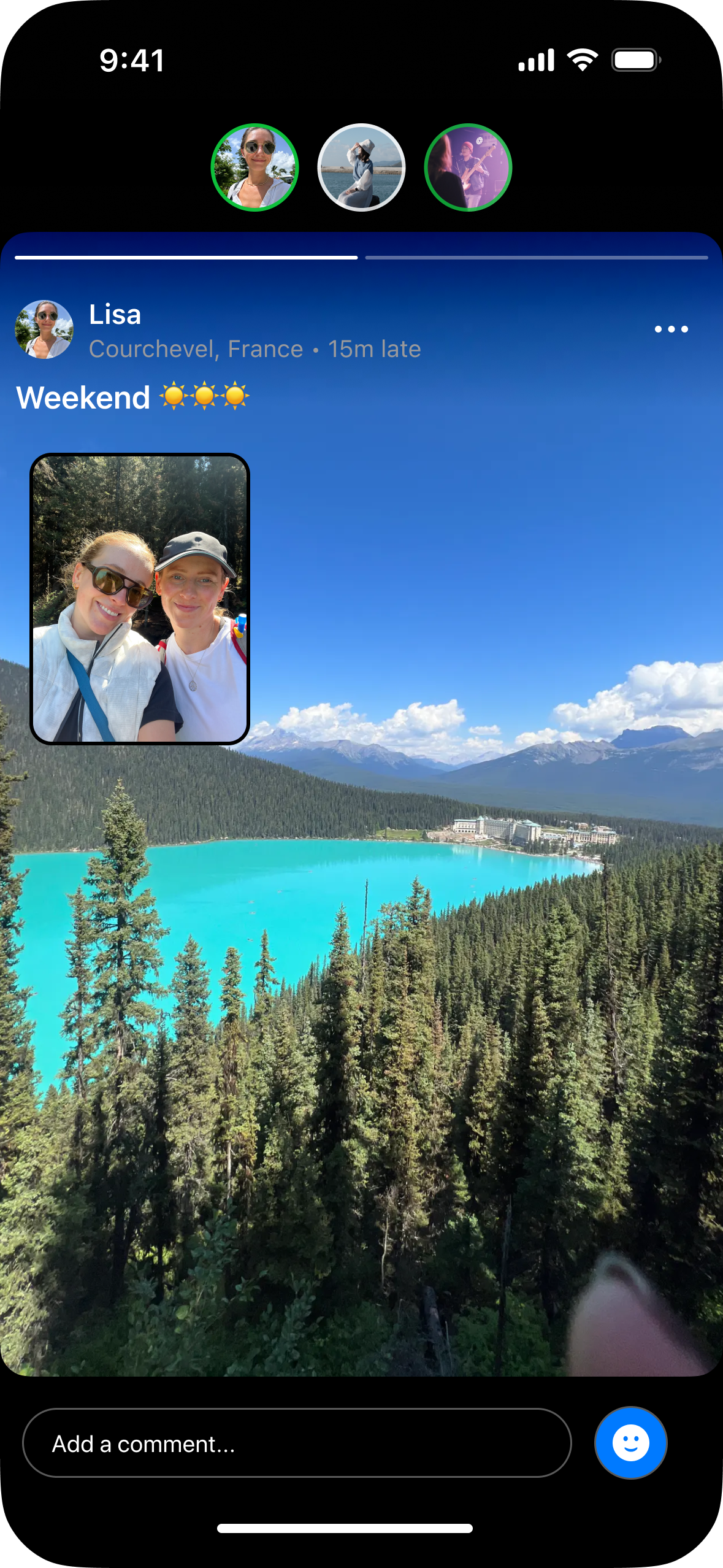
Sharing should feel like showing up, not performing. The goal is a space where your circle feels alive without demanding anything from you. The Circle Reel makes this tangible: instead of each member posting in isolation, the system weaves your circle's moments together into a shared experience, turning individual snapshots into the feeling of having spent the day alongside each other.

Highlight 01

Co-presence in New Circle BeReal

Design Goal

Structure the feed around micro-communities to increase content relevance and psychological safety.

Solution & Outcome

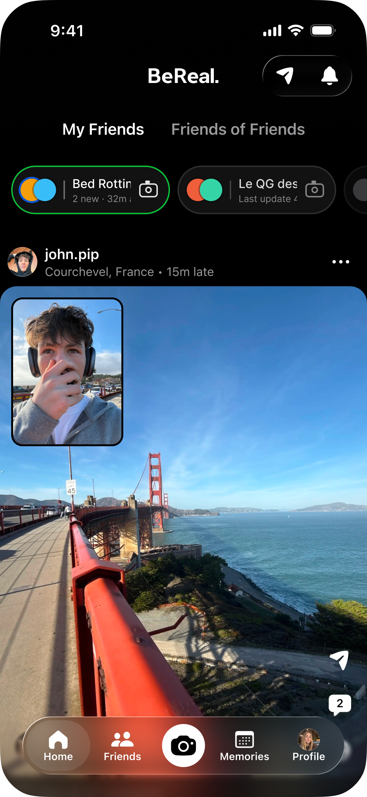
A horizontally scrolling Circle Banner at the top of the primary feed lets users initiate a post directly into a specific circle with a single tap. The Circle Reel then aggregates these moments into a shared, chronological timeline. This shifts the experience from consuming isolated, disconnected posts to participating in a collective daily narrative with close friends.

Highlight 02

Have fun with the Shape Dual Camera

Design Goal

Reduce visual monotony and grant users creative autonomy without introducing heavy editing tools, preserving the no-filter ethos.

Solution & Outcome

Replaced the static rectangular PiP with a draggable Shape Selector — Square, Circle, Heart, Speech Bubble, Cat. This affords greater layout flexibility, allowing the selfie window to interact dynamically with the background environment. The shape carries through from capture to posting to the reel, significantly reducing feed repetition while maintaining raw authenticity.

Highlight 03

Make static moment vivid

Design Goal

Sustain user attention and improve content immersion during memory playback without altering the original raw assets.

Solution & Outcome

A subtle slow zoom-pan is applied to the primary camera layer during Circle Reel playback. The photo itself is untouched; the motion is entirely in how it is presented. This interaction pattern introduces dynamic movement to static assets, elevating the viewing experience and reducing cognitive fatigue when reviewing daily logs.

Caveat and design consideration

The motion effect may confuse users expecting a purely static photo, and is not inclusive for those who require reduced motion. As a further design tweak, I would consider adding a toggle in the app to enable or disable this enhancement, or giving control to the person who posted.

Highlight 04

Redesigning Audience Visibility and Error Prevention

Design Goal

Improve system status visibility to mitigate privacy anxiety and prevent accidental over-sharing, such as sending a private moment to the global feed.

Solution & Outcome

Replaced the implicit default audience setting with a prominent, explicit Audience Selector placed directly adjacent to the primary Send CTA. The button uses dynamic labeling and icon stacking, displaying overlapping group avatars or a count when multiple audiences are selected. The selected privacy scope is highly visible at the exact moment of publication, ensuring the audience is never a guess.

04

Design Details

01: How might we introduce the "Circle" in the Feed

List Banner List Banner

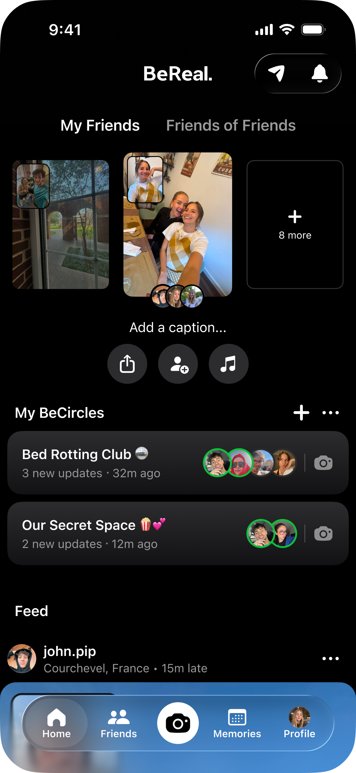
Circles as vertical rows below the "Your BeReal" block. Good information density as the avatar stack shows the circle members, but competes with the feed. Users have to scroll past circles to reach their friends' posts.

Top Circle Badge Top Circle Badge

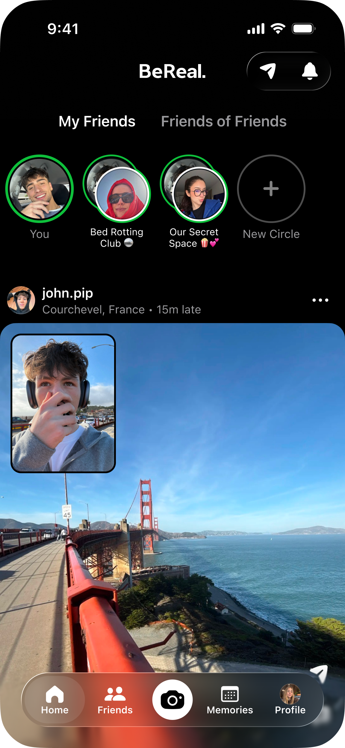
Instagram Stories-style circle avatars in a row. Familiar but every item looks identical. No name, no streak, no signal of which circle is active. Too narrow to display the complete circle name.

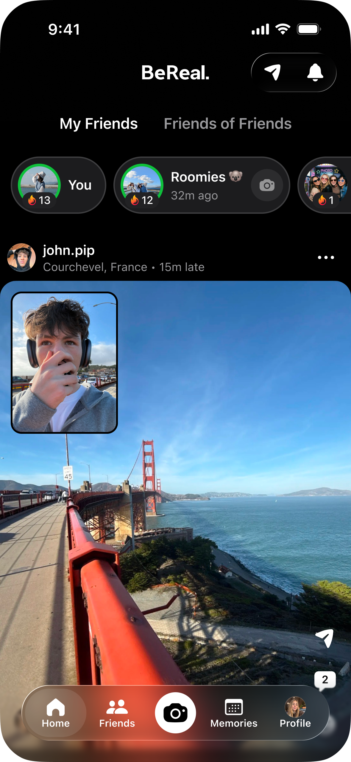
Circle Pill Banner Circle Banner, pill format Final Design

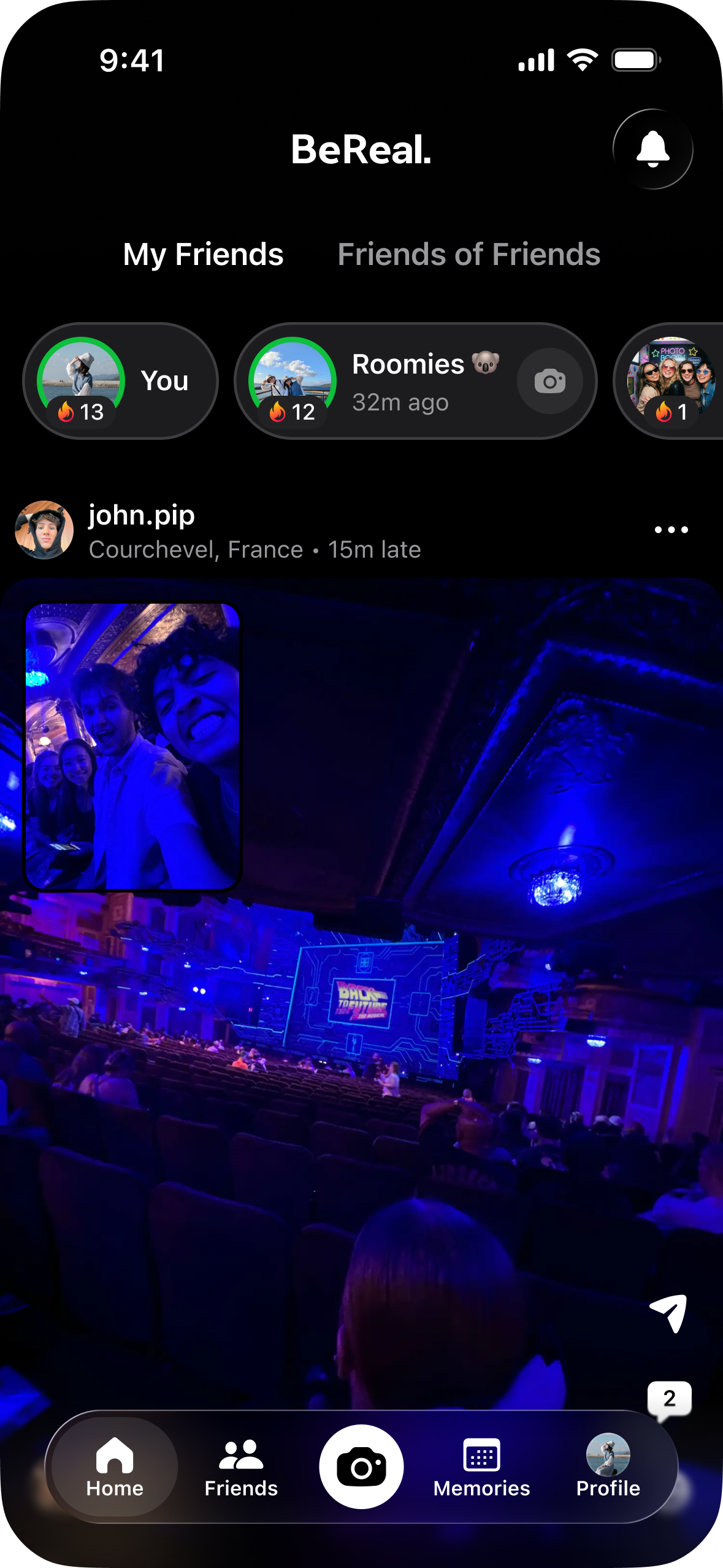
A horizontally scrollable row of pills, each carrying the circle name, a composited group image, activity time, and streak count in one compact unit.

The camera icon inside each pill makes circle-scoped capture a one-tap action directly from the feed.

A marquee animation scrolls the circle name within the pill, so long group names are never truncated.

02: How might we create an immersive co-presence Circle BeReal

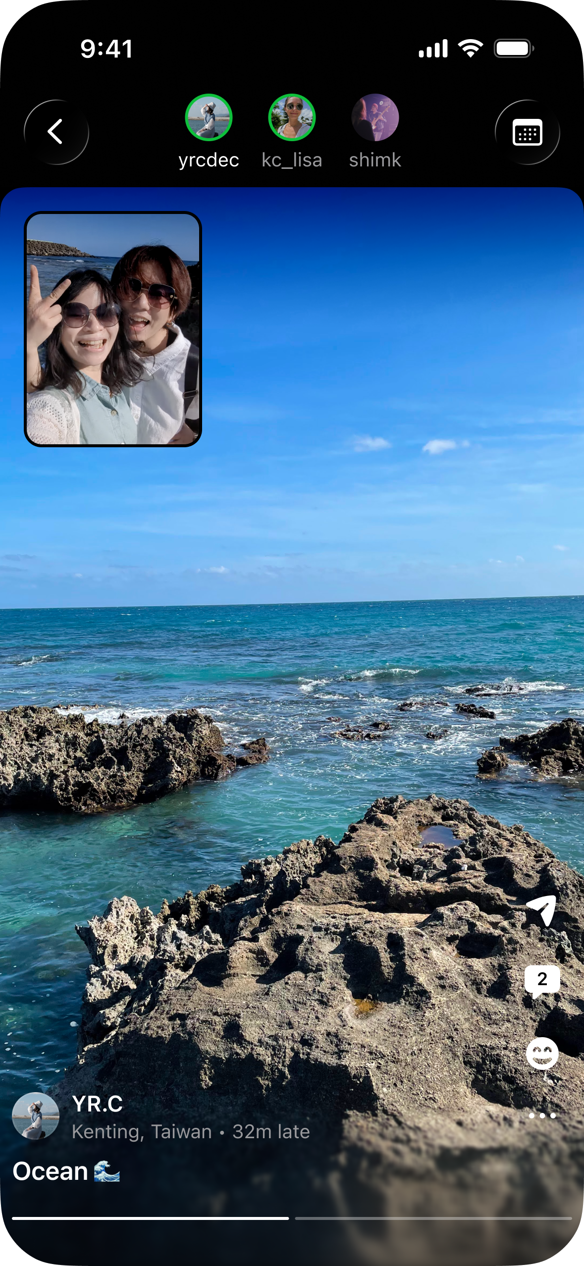
Post style, top info Post style, user info on top

Member avatars at the top, post details at the top. Closer to a familiar feed layout, but the post-card framing reduces immersion and the caption mixes with the picture in picture.

Full screen, bottom info Full screen, user info at the bottom Final Design

The immersive full page with the slow zoom-pan and progress bar give each moment its own time.

Easily navigate with avatars and names. The transition — the reel expanding from the circle pill and collapsing back on close — reinforces that this content belongs to that circle.

The Circle memory entry point allows people to check it from time to time.

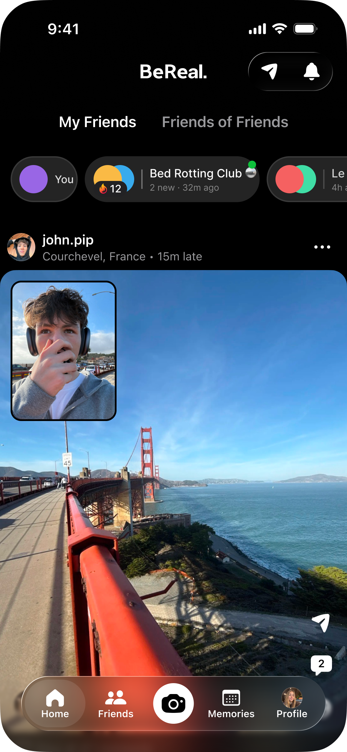
03: Circle Banner polish — from avatar stack to group image

Avatar stack with camera button Avatar stack with camera button

Layers member faces. Recognisable as a multi-person group, but hard to tell the details. Very complex in compact space.

Avatar stack without camera button Avatar stack without camera button

More space to show the group name, but I still want to promote the camera to encourage users to take a photo directly from the circle entry point and share within the circle.

Composited group frame Composited group frame Final Design

Shows the group image. Reads immediately as a group.

The streak count encourages circle members to stay engaged.

05

Next Steps

Quantitative validation of circle behaviors

To measure the success of this redesign, the hypothesis that circle-based engagement yields higher quality interactions must be validated. Key metrics to track include:

  • Average number of active circles maintained per user
  • Posting frequency and retention rates within circles vs. the global feed
  • Changes in the volume of late posts — testing whether smaller audiences reduce performative anxiety

Value-driven monetisation strategy

Current market approaches such as full-screen interstitial ads actively disrupt the intimacy the product aims to build. Future monetisation should focus on adding value to the group experience. Potential avenues include premium features for circles such as unlocking advanced camera shapes, extended reel archives, or high-fidelity memory exports. This aligns revenue generation directly with enhanced user value rather than attention exploitation.

06

Competitor Analysis

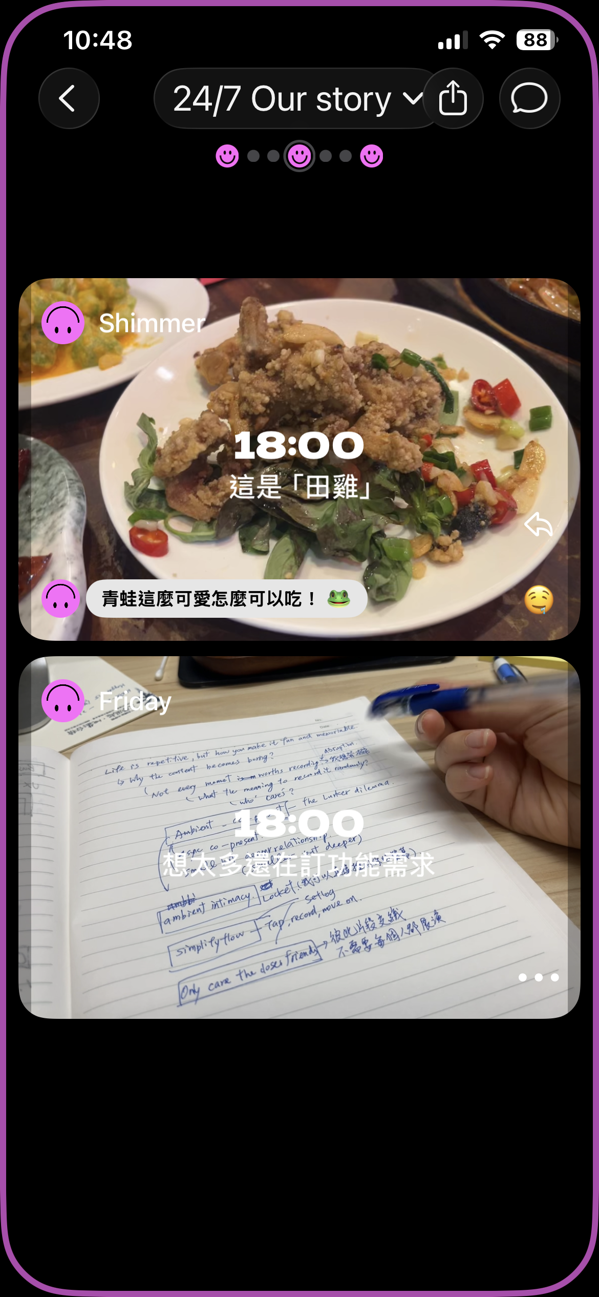
BeReal's decline stems from high-friction posting, audience confusion, and performance anxiety. Gen Z users now crave smaller, zero-pressure private spaces — a demand successfully met by emerging apps like Locket and Setlog.

Locket app screenshot

Locket

Zero-friction intimacy

  • Widget-first design: Live photos appear directly on the home screen for passive, instant connection.
  • Structural limits: A strict 20-friend cap ensures genuine intimacy.
  • No metrics: The complete removal of public feeds and follower counts eliminates performance pressure.
Setlog app screenshot

Setlog

Ambient co-presence

  • Low-stress capture: Hourly 2-second video clips with no retakes allowed — capture becomes a quick reflex.
  • Automated vlogs: The system auto-stitches everyone's daily clips into a seamless shared diary.
  • Private logs: Invite-only groups strictly capped at 12 people.

Key takeaways for BeReal

  • Enforce structural intimacy: Replace confusing audience settings with hard-capped Circles to guarantee a safe, private environment.
  • Composition over performance: Shift from stressful solo captures to collective shared diaries, where intimacy is built together.
  • Adopt passive consumption: Home screen widgets as the primary feed lower the friction of opening the app.
07

Design Execution

High-fidelity screens in Figma covering the core Circle BeReal flow — Circle, capture, and selecting audience. Paired with a Claude Code prototype dedicatedly built in React 18 to demonstrate the interactions and motion. 🦾 Happy to talk about more design challenges that can't be covered in the report!

View Figma design
Context01 Design Goal02 Highlights03 Details04 Next Steps05 Competitors06 Execution07